Apr 252013
 

Today is the last day of my break from Dungeonmans. I’m flying back home from Seattle after a truly special trip to an old comrade’s house to help him with his new project. I’ve seen so many of my friends go off on their own over the last 12 months, layoffs plagued the industry and they always spawn a crop of developers who feel that the time is right to set off on new adventure. There’s room enough for everyone who wants to provide something new, interesting, or just plain fun. Best of luck to all of us!

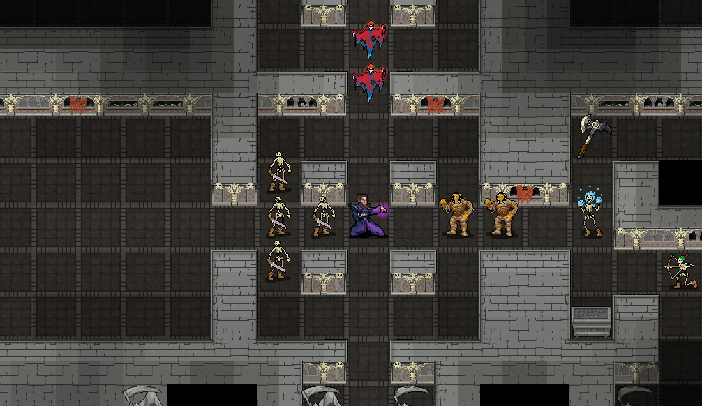
Keeping that in mind, there’s been no Dungeonmans development on my end, which would make this Development Update a bit hollow. Fortunately, Artistmans Bobby Frye has been cranking away on various pieces of the Dungeonmans world, and with his blessing I’ll share some of his work here. Props, rocky grass, various items that litter the scrobold warrens of the world, and the start of a new environment: caves!

That’s it for this week. Now I’m off to stuff myself into an airplane seat for about seven hours of travel. Good thing I’ve packed some (pre-identified) sleeping potions to help the trip go by quickly! Next week I’ll have plenty more to talk about, but until then, enjoy some of Bobby’s work.


Apr 182013
 

I’m traveling this week and the next, so development will be slower. For this Dev Update I’d like to share a story about some wisdom dispensed upon me over drinks, as so many wisdom-dispensing events are.

September of last year I was having a friendly and robust discussion with a friend of mine about game development. We’d worked together for a couple of years at Gearbox and get along rather well. He’s a salty developer from across the pond who has been making games for just about twenty years. We share similar opinions on a majority of development ideas, but not all of them, which made this discussion particularly interesting.

We were talking about the projects we were both interested in, and as I was discussing Dungeonmans I could tell he had something to say. The statement came to him mid drink, and as he put the glass down he let me have it. “Procedural, you see, is bullshit. It’s bullshit. It’s Anti-Design.”

He went on to sing the praises of solid, concrete design, a design that you test, tear down with critique and build up to be even stronger. Procedural becomes bland too quickly because you don’t have focused experiences, unique and interesting, tuned to fit the challenges of the game. “Too many people think they can get away with not having to do the hard work of design because ‘Oh, just let the computer make something fun!’ and what you end up with is terrible.”

Programmers, mostly. Always the problem, lazy engineers!

“What is a Dungeon? A miserable little pile of hallways!”

Anti-Design. I’ve thought about what he said quite often, and it especially comes to mind while planning the layouts of adventure areas. Surely one can’t dismiss all procedural work as uninteresting, or even lazy. There’s plenty of examples of procedural experiences being entertaining. Are those the exception to the rule?

If you’re a roguelike fan, you’ve seen Anti-Design first hand: too many dungeons that are compilations of rectangles and straight lines, salted with an assortment of creatures based on how deep in the Caves of Grim Darkdoom you’re in. Not to say that it can’t be fun, but there’s certainly an element of familiarity to it, which eventually becomes repetition.

Good design, however, comes in many forms. Even the most haphazard of dungeon layouts can still rest upon a well thought out system. Combat, powers, encounters, all of which are indeed tuned and usually iterated upon based on feedback from the community of gamers. Those things can make or break a game, but even at their best they still are weighted down with qualifiers if the adventuring setting is bland. “Well, it’s a typical dungeon crawl, but there’s some neat tricks to the combat.”

As the genre ages and evolves, we’ve seen far more variety and hand-tuned effort in layouts. DoomRL contains many levels that are static, but hand-tuned to provide a specific challenge. Brogue is laid out in a semi-random fashion, with certain threads appearing throughout: chasms or pools in the center of the map, treasure rooms generally (but not always) near the edges of the map, and often guarded by complicated rooms full of traps. Crawl contains some areas that are built on specific formulas, such as the Sewers. Even old dogs like ADOM have Tension Rooms and special layouts for places like the elemental temples.

Avoiding The Trap

I’m working hard in Dungeonmans to avoid a dulling similarity between areas. As described previously, layouts change based on the locale, and they’re built to provide different types of challenges in each. But there’s more than just Dungeons. Towns need to have intelligent layouts, as well as the grand overworld itself. That’s a really tough one. It’s a challenge to make a continent that doesn’t feel like a haphazard collection of locales, and honestly I haven’t nailed it down yet. Never give up!

More and more developers are putting together their own roguelikes and we continue to move farther away from the trap of Anti-Design. Many of us have dreamed of being able to write the perfect generation algorithm  and toiled for countless hours to create something that can generate an exciting and interesting battlefield with one command. Computing power grows and helps us along the way for sure, but for the foreseeable future at least, it’s going to take someone behind the wheel to guide the ship. Why does X feature go here, what makes Y interesting? Everyone has their own answers to these questions, and like a collection of chefs each making the same dish, the results are flavored with a personal touch.

Apr 112013
 

Been pushing on two initiatives last week, one of which was reimagining the role of towns in the overworld. Early builds of Dungeonmans had towns built much in the same way as dungeons: mostly random layouts with winding paths between rooms.

These towns were unique without being unique. Sure you never knew exactly where or what shape the Inn was, but it didn’t matter, you’d find it and it would be the same as every other Inn. An Inn, a Shop, some houses with pleasant peasants and the occasional Town Mayor, a portly man who’d offer you a quest to go kill Scrobolds somewhere.

The end result of all that is that towns were boring, and that won’t cut it for the Dungeonmans of today. They may never be as exciting as actual dungeons, crawling with monsters, but a new town on the horizon should make the player happy and eager to see what’s inside.

So, yeah: Towns.

Towns are focused, small locations with pleasant layouts. Using a psuedorandom location builder similar to the Crypts, towns are a few houses and shops built along some roads or nice park land. Navigation should be easy.

Towns contain a few houses and shops, and one main attraction. The houses have NPCs to say silly things, bookshelves to plunder and barrels to kick over. Wouldn’t be an RPG without that. The shops are selected from a wide variety of shop types. “Weapon Store” is a bit generic, but maybe this town has someone who focuses on cloth armor, or a collector simply obsessed with hammers. The shops are a chance to put your gold to work.

The Main Attraction is a reason to come back. The most basic example would be a tavern that serves a delicious, stat-enhancing meal. It won’t be useful for all time, but it would be of use while you’re in the area and you may want to remember it if you’re hunting in the wilds nearby. Perhaps there’s a super fancy artisan who has exceptional gear on sale for an outlandish price? Maybe there’s even crazier stuff I’m not going to talk about here? Let’s hope so.

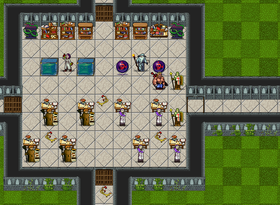
Here’s a couple of screens showing the new art. Bobby’s environments are starting to roll in, and you can see the Crypt for the first time, as well as new and improved Academy art. Click for larger versions, though I’ll be damned if the page listens to me when I tell it to open them in a new tab.


Apr 052013
 

This has been an incredible week for development! Some important stuff has fallen into place in recent days:

  • A collection of light, medium, and heavy armor sprites: multiple tiers, multiple gear slots.
  • New and improved art for the Crypt and Dungeonmans Academy.
  • Music system lurching to life: intros, looping sections, and the beautiful overworld theme.
  • Retooling the UI with vastly improved art and item information descriptions.

Dungeonmans has been around as a project for a long time, with a great collection of art and development assets, some of which have aged better than others. Clearing out the old items and entering the new is somewhat time consuming but quite rewarding! I’m seeing new gear drop from prettier monsters in improved areas, with the awesome dungeon background track playing, it’s terrific.

I’ll admit, today I was so wrapped up I forgot it was Thursday until just a little while ago. I really enjoyed last week’s update, because talking to people and learning from them is super fun and one of the best parts of running your own project. At the same time, sometimes you just gotta knuckle down and work. My apologies for being light on content this week.

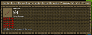
I do have a screenshot of a wonderful bug in the new UI, one that I might want to fix given the small, itsy-bitsy potential for balance and misinformation issues:

 It's burning for *you*.

That’s it for now. Thanks for reading!